5 Ways To Ruin Your Landing Pages

Why use a landing page? Well, rather than sending people to your homepage right away, you can use a discreet landing page focusing on a key message and offering an unambiguous call to action (CTA). The whole point of a landing page is to convert visitors in to leads, so it needs to look the business and do its job efficiently. To achieve this, steer clear from the following five mistakes.
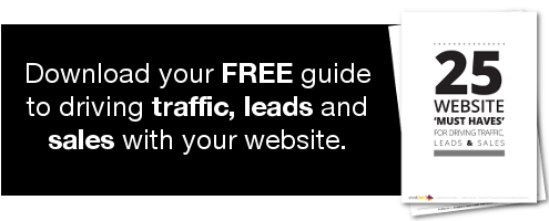
Vague or hidden CTA
A call to action has one purpose: to provoke an immediate and specific response, such as getting in touch, downloading a resource or finding out more about a particular product or service. If your CTA doesn’t stand out, is hard to find or doesn’t communicate clearly, why should a visitor click it? And if they do, but it doesn’t work, or directs to the wrong place, you’re really going to put off any potential buyers.
Irrelevant content
People are usually sent directly to your landing page via social media, paid advertising, email campaigns and other sources. Once they’ve arrived, they expect to discover what was promised, not something off the mark or completely different. For example, if you tweet saying “Download our free Guide to optimising your website” but the landing page asks you to first watch a video or fill in a lengthy form, you’ll find that people exit the site without taking any positive action. Be honest and concise, then deliver what was originally offered.
Lack of trust signals
If someone has been directed to your page without any prior knowledge of your brand, they need some reassurance before signing up to a newsletter or downloading a resource. Social proof of trusted relationships can be provided in the form of testimonials and endorsements, which when combined with a link to Terms and Conditions will succeed in putting the visitor’s mind at ease.
A visual nightmare
Your landing page is meant to grab attention, inform and stimulate a response, so the design, layout and copy have to be of the highest quality. Clunky navigation, poor visuals and badly written content do nothing more than hinder and dissuade, so invest time into allocating the right job to each person. If a visitor can’t assimilate the page within 15 seconds, you might as well remove it entirely.
Typos, spelling, grammar and wording
Your copy should be eloquent and persuasive, otherwise it will disrupt the flow of your messages and reflect badly on the brand. It’s not simply checking spelling and grammar, as syntax plays a large part too. If your sentences are too wordy, clunky, fuzzy or just plain bewildering, your customers will become frustrated and ultimately leave the site without moving down the sales funnel.
We specialise in building digital campaigns that generate real business leads, to find out more, get in touch on 0800 998 7502 or tell us what you need using our contact form.